The visual part of your branding will become the symbol that you will be recognized by, or your logo, along with the colors, textures, fonts and other graphics that represent your business visually. A logo is the centerpiece of your brand and careful thought and consideration need to go in to determining exactly what this will be.

So, where do you even begin?
Well you’ve already started by determining who your ideal client is, defining exactly what you’re selling, figuring out what your niche and niche slice are and creating your tag line. Now that you know this, you can create a logo that your ideal customer will identify with and remember.
There are essentially five types of logos. The first is a symbol that clearly represents what service or product a company provides, just by the image in the logo. For example, a construction company might have something as simple as a hammer as part of their logo. Think of companies like Mercedes, Nike & NBC. Just one look at these symbols and we all know what company they represent.

A symbol type logo will also play a major role in your identity. If you decide to use a symbol to represent your brand, choose it wisely, make it appropriate and memorable by selecting colors, size and detail that work for you. Remember, sometimes less is most definitely more.
The second type of logo is a font-based logo, or wordmark. Take FedEx for example. Can you see the hidden symbol in the words? (Hint: look between the E and X).

What about “Ford”? Even the font has been named after the company that made it notable. Many companies turn their name into their logo because it’s memorable and you’ll never NOT associate that logo with that company. More examples include EBay, Google, and Coca-Cola, and Facebook to name just a few.
Alternatively, the 3rd type of logo is a variation of this, called a lettermark, which utilizes just the initials of your company. This often works well for individuals who are branding themselves more specifically than a company.

The fourth type of logo is a combination of both a symbol and a wordmark or lettermark. Look at the examples below of how to combine words and symbols for the effect you’re after.

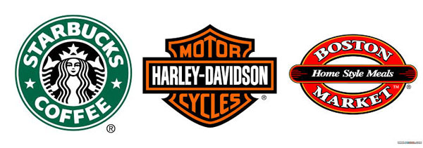
Lastly, the fifth type is an emblem. An emblem style logo would encase the company name or initials within the symbol. Some examples include Starbucks (even though now Starbucks uses only the mermaid, as it is synonymous with their brand), Harley Davidson and Boston Market. These work well if you’re after a bit of a nostalgic or retro look.

A logo should be a more simplistic image, regardless of what type you decide to go with. Think of what other media you might use it in, besides just a website and business cards. If you want embroidered shirts or ball caps, will it reproduce well? Too much detail might make it unrecognizable on certain media and then it’s not serving its purpose, which is representing you.
Some helpful tips:
- Check out your competition. Are your competitors on the conservative side or are they all about the bling? Consider how you can be different and set yourself apart.
- Don’t forget your message. Decide what it is you want to say about your company. Are you a more serious type or are you known for being a bit silly maybe? Ask the same question about your audience. This is very important in coming up with your overall design.
- Keep it simple. Anything too ornate or detailed might look okay on a business card, but it won’t translate well to other media such as baseball caps or t-shirts. A good logo should be scalable, easy to reproduce, memorable and distinctive. Icons are better than photographs, which may be indecipherable if enlarged or reduced significantly. And be sure to create a logo that can be reproduced in black and white so that it can be faxed, photocopied or used in a black-and-white ad as effectively as in color.
- Your business name will affect your logo design. Think of how different fonts might be combined for effect, such as script and block fonts. Also, think about the words in your business name and if any of them actually are objects where an obvious symbol would work as a logo, such as a clock, a lightning bolt, a diamond, etc.
- Use your logo to portray a key benefit of your business. The best logos make an immediate statement with a picture or illustration, not words. For example, if the name of your business is “Power Performance Training”, maybe a lightning bolt would symbolize not only the “power” part of your business name (maybe that’s your last name?), but also the “power” behind your brand. Think about the double meaning of words and how they can be used to your benefit.
- Don’t use clip art. However tempting it may be, using clip art that is recognizable as not unique will only make the statement that you’ve cut corners and skimped on one of the most important aspects of your marketing. Given that, your customers might also wonder what else you’d cut corners on.
- Avoid making drastic changes or being too trendy. Find something that will stand the test of time and be a classic symbol. Or, if you’re trying to redesign or modernize your brand, make subtle changes, over a period of time so as not to alienate and confuse customers about who you are.
Work with a designer.
While it’s important to brainstorm and come up with concepts and ideas on your own, trying to design and create your own logo by yourself could be a costly mistake. While many high priced design firms will charge thousands of dollars for a professional logo, you can also find plenty of freelance designers who are much more affordable.
Be careful of choosing someone based only on price however. The old saying, “You get what you pay for” rings true in many cases. Try to find someone who is familiar with your field, and your competition. Even if it still seems costly, remember that you’ll most likely be using this logo for years to come, so over the long run, the cost may seem more reasonable.
After discussing your thoughts on images, textures, colors, etc., a designer can put together several concepts for you to narrow down the field of possibilities. These concepts would ideally include the symbol or wordmark that would be used, along with fonts, colors and other textures that you would use as part of your overall visual branding.
Protecting Your Logo
Once you’ve come up with a logo that summarizes your mission with just one glance, consider protecting it with a trademark from the U.S. Patent and Trademark Office. This can be done online either directly at the USPTO website or through various other websites that will take care of the paperwork for you.
Filing a trademark will protect your logo from being used by other companies without your authorization and ensure that your hard work is safe and belongs to only you.
Save

