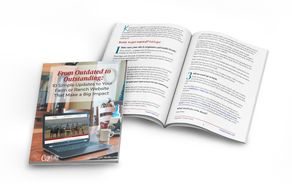
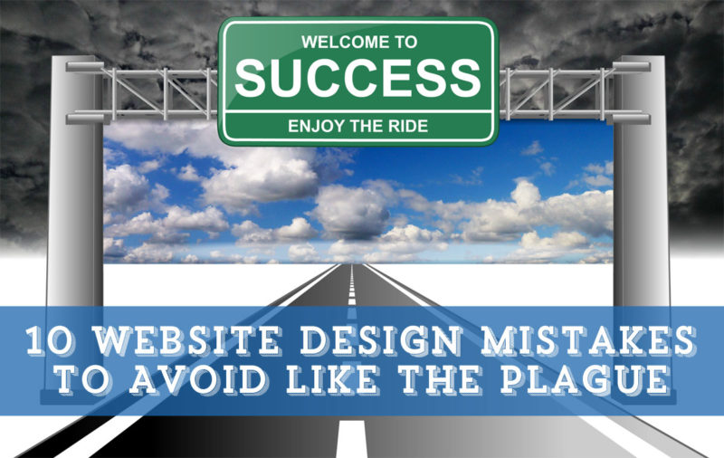
As much time as I spend on the internet, I frequently run across sites that, in my humble opinion, could use some improvement in a few key areas. The internet is probably the single most important marketing tool that businesses have these days, and to not use it to its full potential is a waste of time and valuable bandwidth.
To that end, I have listed out several of the infractions that I’ve noticed could be improved on various websites, and how I would improve upon them. Using these tips, my SEO tips and the wealth of additional information that is available on the internet, slowly but surely, you too can reap the rewards of a successful website and business.
Be sure to read all the way to the bottom for my 11th Bonus Item added in my last revision!
- Your website is not responsive or mobile device friendly. These days, with smart phone and tablet usage on the rise, if your website is not responsive so that these mobile devices can easily view your site, you are missing out on valuable business. In fact, Google is already penalizing sites for not being mobile optimized. What this means for you, is your site will not be returned in organic searches as often as sites that ARE optimized for mobile devices. This is not a trend, so get on board and make sure your site is up to standards.
- Not enough interest and dimension to the site. Remember how when you were a kid and all you wanted to do was look at the pictures? Well, things haven’t changed much, and we still need other elements worked into the text to engage us and keep our interest. A page full of words is overwhelming and boring, and will probably lead your visitors to click off and go somewhere else. Great photos and graphics are easy to find on stock image sites, so spend a few bucks and greatly improve the readability of your pages.
- PDF files for reading text. Now, as important as Search Engine Optimization is, most things are better off in HTML, as opposed to a PDF file. Not only does it keep your reader in your site, but you can fill that text with keywords and phrases that you’ve optimized your site with. Of course, if the information needs to be portable or is a form of some type, by all means, create a PDF document. In the past, search engines were not able to crawl PDF documents, and that is still the case for PDF files that were created with an image editing program like Photoshop. But, if you create a PDF text document from a program such as Microsoft Word, that PDF file can be read by search engines. For tips on how to optimized your PDF file for SEO, read How to Optimize Your PDF Files for SEO.
- Fixed font size, or too small of a font. Let’s face it, we’re all getting older and the old eyeballs just aren’t what they used to be. There is nothing more frustrating than digging out a magnifying glass to read content on my screen, so set up your CSS to use flexible font sizes, as opposed to fixed. If that doesn’t work for you, then at least make your font size large enough (at least 12pt.) to be legible by those of us approaching the half-century mark and older.
- Bad page titles. This one really gets me! Not only are page titles KEY to your SEO practices (they’re the first thing to be crawled after your domain name), but it will help your visitor keep track of where they are, especially if they have multiple tabs open in their browser. Nothing is worse than looking up and seeing “Home Page”, or “Page Title Here”, instead of “Affordable and Reliable Carpet Cleaning | Sacramento | Joe’s Carpet Cleaning”.
- A non-dedicated URL. As inexpensive as it is right now to register a domain name and purchase a hosting account, there is no longer any good reason for going with a free service like Weebly or Wix. With the free services, you’re forced to use their templates, which are less than professional, and your SEO efforts will suffer tremendously by not having your own URL. Show your professionalism and give your customers the confidence they need to purchase from you and not someone else.
- Pages are not optimized. Slow page load times lead to a higher bounce rate (visitors exiting your site from the same page that they entered on), so be sure to optimize your images and your code for faster loading times. Don’t load your page with too many unnecessary images, and stay away from busy, gaudy page backgrounds. Your visitors will enjoy their experience on your site much more, if you do.
- Poorly Designed Sales Landing Pages. To me, these fall into the same category as monster truck commercials, used car salesmen, fingernails on a chalkboard and infomercials……you get the idea. It is non-stop scrolling and scrolling to read all about a certain product and how great it is, and miles of scrolling later, you finally get to the bottom line. If I land on one of those pages, I usually leave immediately because I’m just not going to take the time to read it all, which leaves me to wonder how many other people are as annoyed by those as I am and finding somewhere else to cruise?
We do need sales & landing pages to promote our products from time to time, but there are ways to create them that are interesting, fun, will draw the reader to your Call to Action and not put them to sleep with 80,000 characters of mindless text. - Tables, tables, tables. Now sometimes tables are necessary, but they are no longer necessary for page layout. Because of the excess code they create, they can increase page load time and moderately hinder your SEO, so my advice is to avoid them if possible. Learn CSS, or find a designer that knows it already so you can spend your time making money instead of fiddling around with your website.
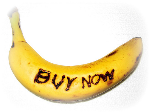
- No call to action. Websites are all about business and converting visitors into customers, so why would you leave out the all important call to action? Give your visitors a reason to contact you, then make it easy for them. Let them know exactly how to do it, and while you’re at it, offer them something really cool in exchange for making contact with you. Undoubtedly you have some knowledge they would benefit from, so put that in the form of a downloadable report or an E-book and offer it for FREE, in exchange for a name and email address. You can then follow up with them, or perhaps send them your newsletter.
- Not having an SSL certificate installed. As of July 2018, Google Chrome began displaying the words NOT SECURE on websites that did not have an SSL certificate installed. To many website visitors who interpret this as a website possibly being hacked, they’re likely to leave and find somewhere else to get the information they need. SSL stands for Secure Socket Layer, and adds an extra layer of encryption and protection to websites. Sites that are protected with display a green padlock in the address bar of most browsers.
It used to be that only eCommerce sites needed this protection, but these days ALL sites need this to maintain whatever Google ranking you have, as Google is ranking sites without an SSL certificate lower than comparable sites with an SSL. As difficult as it can be to keep rankings up, can you really afford to have even lower rankings?