5 Things You Can Do to Your Website to Make You Look Like a Pro
We all know how important it is to be professional in our business, right?
We want to be taken seriously, to set ourselves apart from the competition and be memorable, but we need to be memorable for the right reasons.
Often times a potential client’s first impression of your business is your website. What will a visitor to your website see when they get there?
Hopefully they will see a website that is attractive, well thought out, easy to navigate, has a clear message of who you are and what you do, and solves a problem for them, which is why they’re looking at your website in the first place.
What’s the big deal about websites anyway?
Believe it or not, I have actually had people say to me that websites just aren’t all that important.
Say, what?????
If this is you, please come clean and shoot me an email, and I will proceed with an intervention that will make even Dr. Phil proud.
Show of hands….how many of you still use the Yellow Pages? No, not the app, the actual book that weighs 30 pounds and takes up an entire side of one of your kitchen cupboards?
If you said no to this, then guess what? That probably means that you’re looking online for products and services.
And, so are most of your customers.
If you don’t have a website, are you advertising in the yellow pages? If you don’t have a website because it wasn’t in your budget, how is yellow page advertising in your budget? We all know how expensive that is every month.
Websites are important for many reasons, the first and most obvious being that it’s a great way for new customers to find you. Stop denying the public the opportunity to work with you and discover how brilliant you are!
Beyond that, many people these days do not consider a business to be all that professional and truly have their act together if they DON’T have a website. A good website will give you credibility, and give people the confidence they need to pick up the phone and call you and actually do business with you. People need to feel like they are giving their money to professionals, and chances are if you don’t have a website, you may not be giving people the warm fuzzies they need to feel safe doing business with you.
Having said that, just because you have a website, doesn’t mean you will automatically be considered a professional.
Some websites can actually do more damage than not having a website at all. What if your website looks like a 12 year old did it?
Okay, scratch that, because most 12 year old kids these days are pretty savvy when it comes to such things, but you know what I mean, right? Is that unprofessional, thrown together, cutting-corners look really the perception that you want the public to have of you?
Start up businesses are always facing budget challenges, so maybe you were trying to save a few bucks and build it yourself, but it’s really not working for you like you imagined it would.
After all, if your business is not web design, chances are pretty good you’re not all that fluent in code, good graphic design, proper layout to increase conversion, and maybe you like all the flowers and swirly things, but your target audience has a thing for camo?
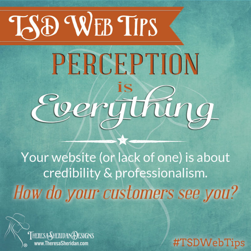
Think about it. Perception is everything, and if you don’t put out a professional image of yourself, why would people want to buy from you?

So, if this sounds at all like the challenges that you are facing and you think your website could use a little help, here are a five things you can do to improve upon your site and help to give it that professional edge it might need.
- If you can’t afford to work with a designer to build a new site, perhaps you can hire one to do some graphic work for you. A professionally designed logo can go a long way towards giving you that professional look. Another idea would be to take a website design course, that will provide you with techniques and tricks of the trade to help you build your own professional website. The key word here is “professional”. If your website looks unprofessional, that is how your visitors will see you, too.
- Study up on website layouts that are meant to increase website conversion (the number of people that take action on your site). Yes, there is a method to the madness! Certain layouts, elements, content, images, etc. will help compel people to follow your call to action and connect with you.
- Make sure your navigation is user friendly, thorough and consistent on every page. If a web site is well planned, a user will never need to go back to the home page to find their way around.
- Visitors to your website should be able to tell who you are and exactly what you do within just a few seconds of landing on your site. If they can’t, revisit your branding and figure out what your niche is and how to best convey that to the world.
- Clearly convey what problem you solve for your potential customers. That is really all they care about, and if you show them that you are an expert in your field and you have the answers they’re looking for, it will give them the confidence to buy from you, instead of your competition.
Need more info? Schedule a free strategy call with me now to see how I can help you keep that professional edge!
IfSave


