Helpful Tips for the Do-it-Yourselfer
Designing your own ads can be fun, as well as practical, however there are many things to consider when attempting to put together an ad for print. Layout is always a concern, as you want to be sure to pull your reader into the ad. Typography, the type of graphics and photos you select, and your target market are just some of the other factors to consider when designing an ad for print.
I’ve put together some basic information to help you get started.
Know Your Target Market
Age will make a difference. Is your market in their early twenties, or are they in their forties and need slightly larger print? Are you designing for a specific culture? In general you’ll want to keep things like reading skills, color and white space in mind, so that your reader can quickly assimilate the information you’re trying to give them.
Layout
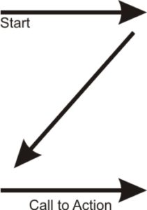
 Layout is an important element. You want the reader’s eyes to flow over the material and not jump from one area to the next. The conventional “Z” pattern for western cultures is an effective way to convey your message. Start in the upper left corner, work across to the right and then back to the left again, going top to bottom. Our eyes sweep the page in a Z sequence, seeing images first, then headlines and display copy, finally text.
Another layout option is the grid. Grids can be in many configurations, but they naturally keep content organized and help direct the reader through the page. As a rule, everything on the page should align with something else. Break alignment only for emphasis, and sparingly within a piece.
Here are some additional guidelines to follow when thinking about your ad layout:
- Use borders when you want to frame and draw attention to information (e.g., table of contents, calendars, special notes).
- Draw attention to boxes or images by using borders with a drop shadow.
- Allow the edges of text columns and artwork to create the illusion of borders.
- Only include layout elements and copy that support the message.
- Use graphic devices such as white space, rules, and images to help the reader understand the content.
- Avoid cluttered backgrounds that make reading content more difficult.
- Increase leading (white space between lines) to lighten the look of the page.
- Leave plenty of white space around type and graphic elements (an eighth to a quarter inch depending on size relative to the layout).
- Leave a little more white space at the bottom of a page relative to the top of the page (e.g., 0.75 inch at the top and 1 inch at the bottom). This will optically balance the page so it won’t look like it is slipping off at the bottom.
Graphics and Images
All too often, poor photographs and graphic images will be used, which greatly distract from the design and the overall appearance of the advertisement. Take care to use images that are clear and sharp, have proper composition and will display the subject in an attractive manner. Poor graphics portray an unprofessional presence. You want your reader to remember your ad for the product or service you are promoting, not for the terrible photograph you used to try to sell them on your company.
- Find a balance between images and text. Too many images can confuse the reader, but too few can leave the ad dry, or boring.
- Keep the style of your images consistent.
- Use graphics and images to direct the reader through the material.
- Be careful that the images used can be reproduced without losing resolution.
Typography
Don’t forget to give typography the consideration it deserves. Effective, powerful ads are created with just typography alone, so be sure to pay close attention to this detail.
- When using more than one type face, make sure they are very different (e.g., a fancy script font, and a sans-serif block font).
- Never use all caps for body copy.
- Never use all caps with highly decorative typefaces.
- Use justified text to be more formal.
- Left justified ragged right is more personal.
- Look for visual gaps between letters or numbers that may occur because of the shapes of the adjacent letters (AT, AV, Te, Wa, 11, etc.). To correct this, use kerning. Kerning is the removal of incremental space between the offending pair.
- Always have someone who did not write the copy, edit the copy.
- Always proof your copy for misspelled words.
- Be careful when reversing type, white or light color, out of a background.
When in doubt, because portraying a professional result can be critical to the success of your campaign, if not your business, contact your graphic designer for help. They can help you put together an ad that will be attractive, efficient and portray your product and your company in a professional, well thought out manner.

